Duration:
11th March - 31th March
(3 weeks)
Duration:
11th March - 31th March 2025
(3 weeks)
Product Overview
The intent was to design a modern and intuitive booking experience for a local barber shop, improving customer engagement and services. Local barbershops usually lack digital platforms to manage appointments, demonstrate services or entice young and tech driven customers which is vital considering how impactful technology is today.
Tools
Figma
Canva
Google Forms
Coolors
Flaticons
Problem Statement
Traditional Barber shops usually depend on customer ques or manuel booking, which can result in customer frustration, long ques, long wait times and poor time management for barbers. There is a need for a mobile solution that enables :
Easy book appointments.
Browsing modern hairstyles and services.
Learning more about the barbers and the shop.
Having barbers that offer their services at your residential location instead of standing in long ques.


User Research
Design Process
Goals of Research
Methods
Key Insights
Ideation
Wireframes
Body : Poppins - Regular.
Thank you for viewing
Reach out via email: alianmuvalahenry@gmail.com
Goals
Form a clean aesthetically pleasing and engaging interfaces.
Provide a smooth and simple booking system that will limit time wasting and long ques.
Create an order system for every hairstyle, this is a system where one of our team members arrive at your residential location to offer our services this is another effort to reduce time wasting and long ques as well as provide the benefits to customers to not travel long distance and have a haircut.
Males aged 14-50
Male working professionals and students.
People who view style and time management as valuable factors.
Clients who are looking for excellent services and consistency in their haircut routines.
Comprehend user behaviour with booking haircut appointments.
Find pain points in established barber shops booking experience.
Learn about digital habits of clients.
Customers are frustrated that they must stand in long ques for a long period of time.
The organisation of the ques is poor with customers cutting in front of other customers.
The services are limited; there is a desire to have more styles and options to have for their hair.
They want an appointment system, to limit the long ques and stop time wasting.
Designing core flows: Home, services and booking steps
Features Priortised
Visible Call to action buttons to book.
Service breakdown information with prices and Order button for users to click and have barbers arrive at their residential location to offer their services.
An appointment breakdown process
Confirmation screens to signal trust.
Low-fidelity sketches were utilised to:
Lay out the user journeys.
Focus on structure and functional thought process.
Make sure the screens follow intuitive patterns.
The wireframe were refined multiple times.
Visual Design
High Fidelity Screens
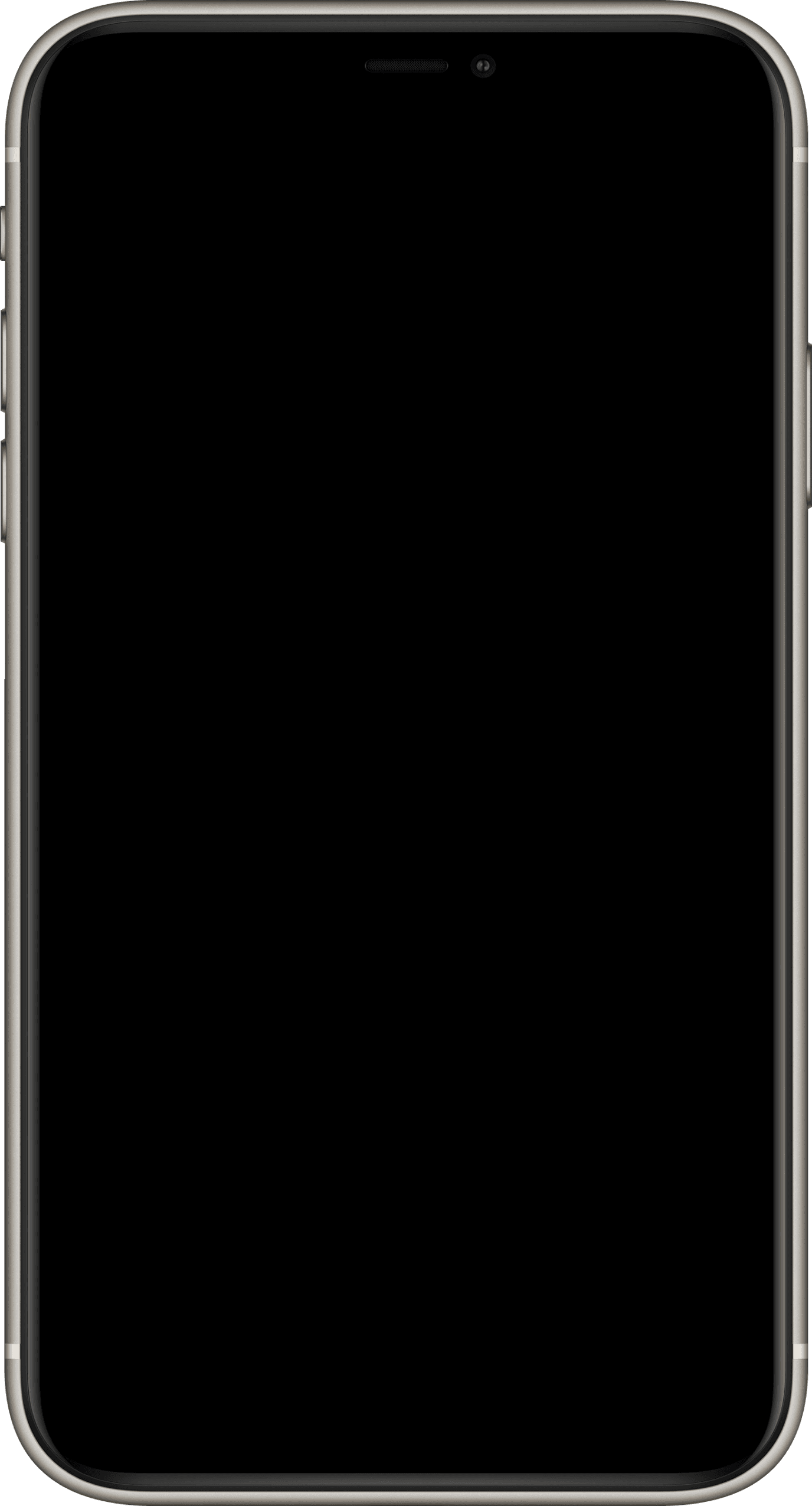
Conducted user research using through surveys.
Tools used : Google forms
Competitor analysis : ( Legends barber and Lincoln barber shop)
Target Audience
Design Thinking Process

Empathise
User Research
User Survey
Brain Storming
Mind Maps

Define
Ideate
Identify key issues in the Empathise stage


Design
Wireframe
Hi-Fi Designs
Prototype

Test
Feedbacks
Conclusion
Refinement
Primary Colour- Dodger Blue
Accent Colour- White
Secondary Colour- Yellow Gold
#EC8000
#0047AB
#0047AB
Aa
Font
Oleo Script
Aa
Font
Poppins

Key Screens:
Home Page
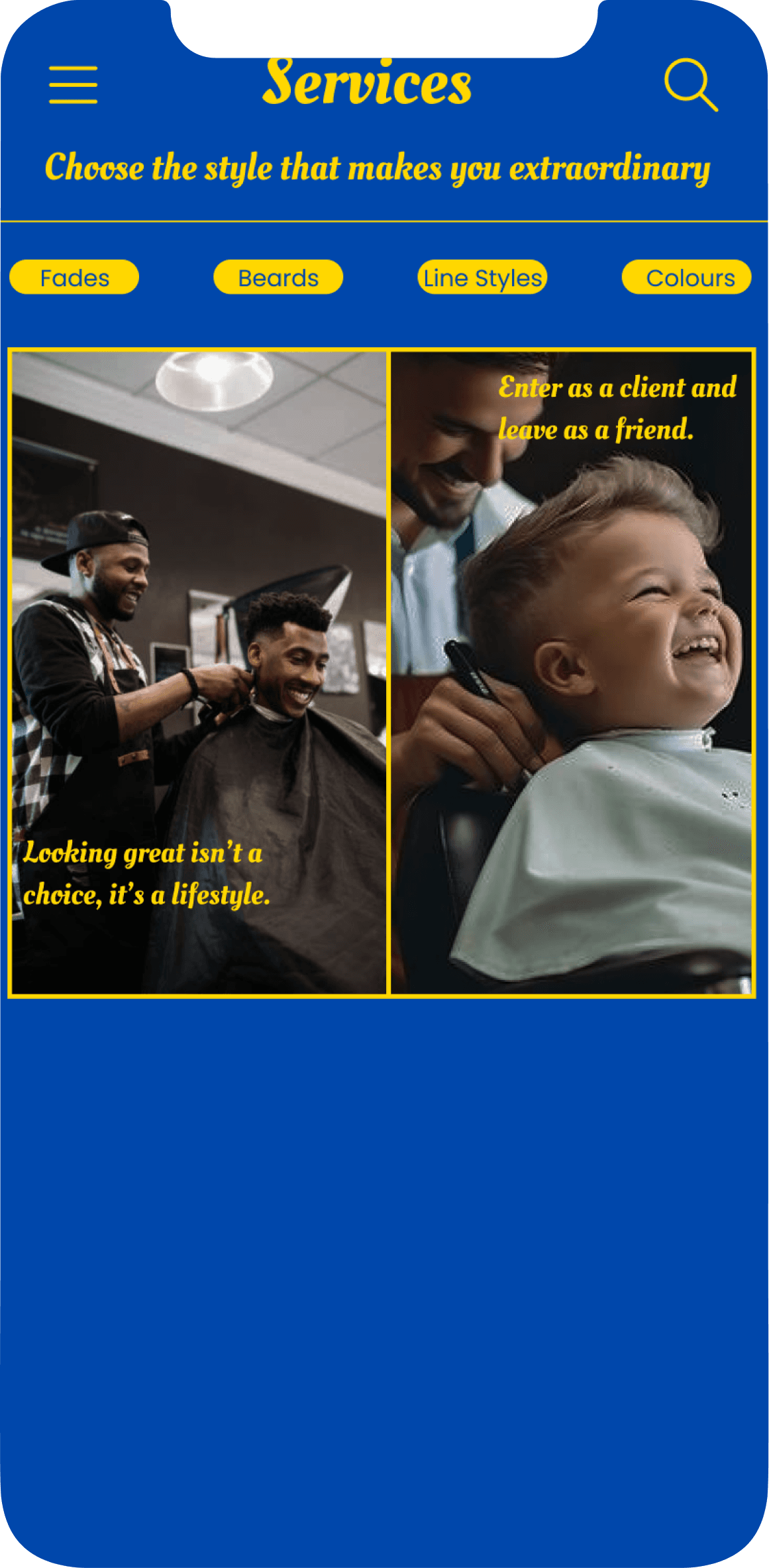
Service Page
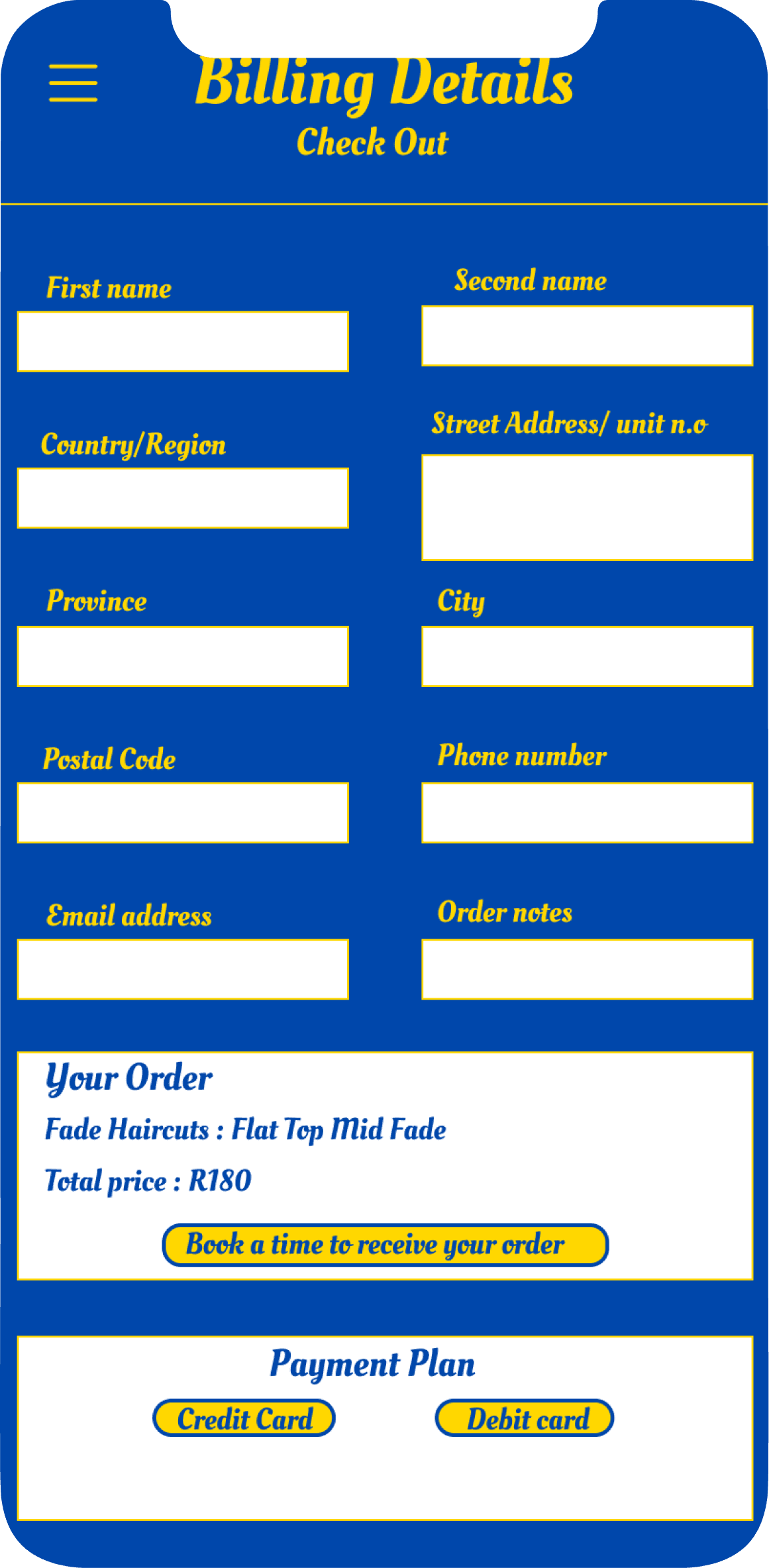
Billing Details
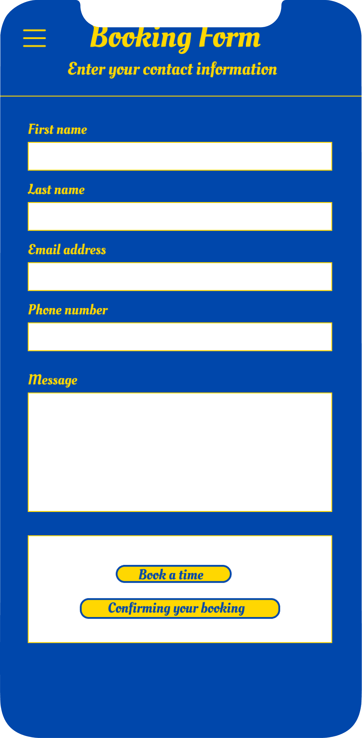
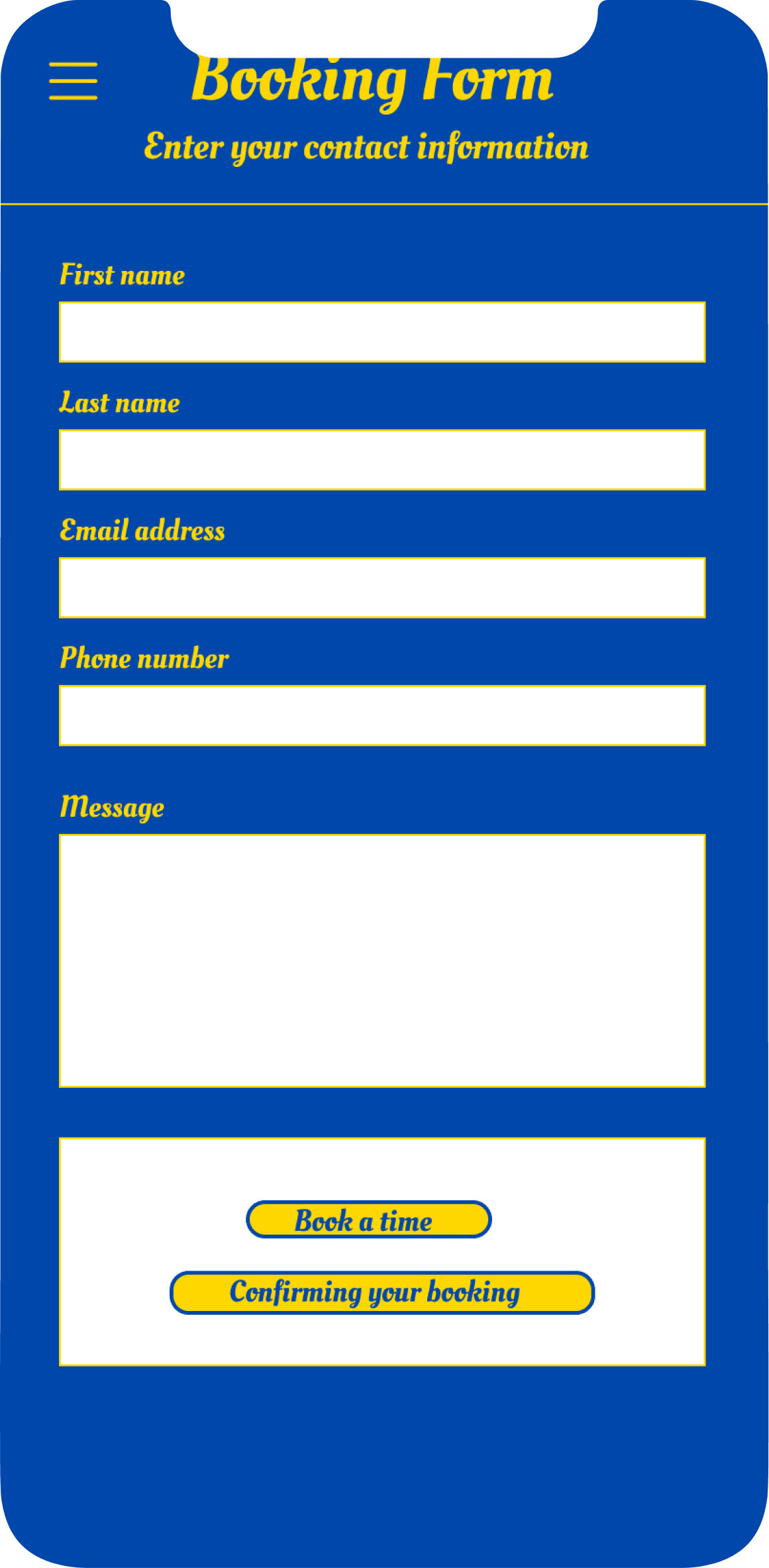
Booking Form
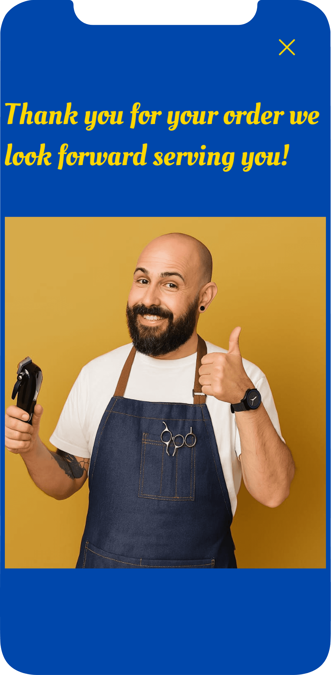
Confirmation Screen
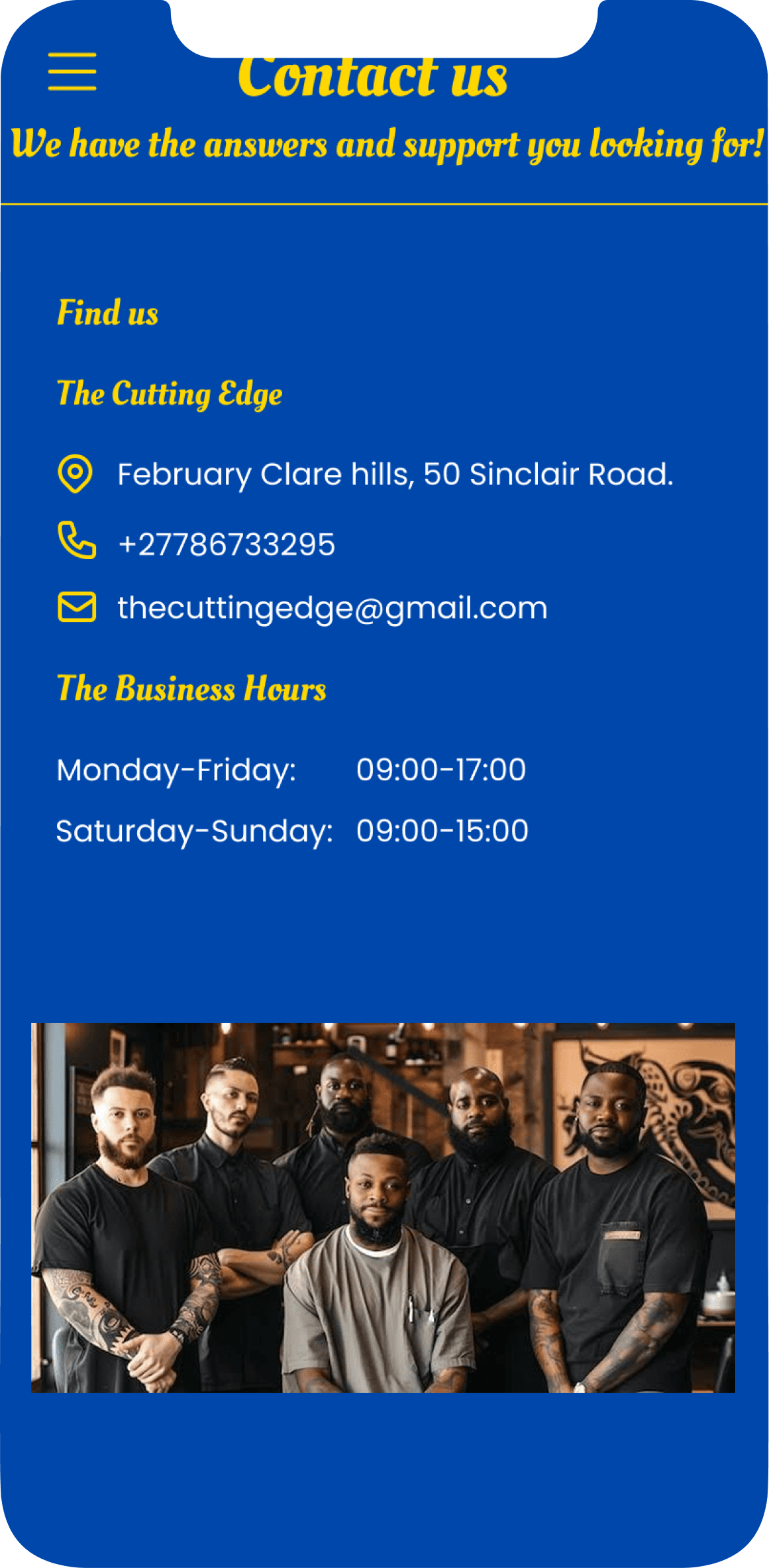
Contact us
Brand identity is revealed. There is a booking call to action button that leads to the booking form for users to book for an appointment, description of the culture, contact information and menu icon. This is the foundation of the app.
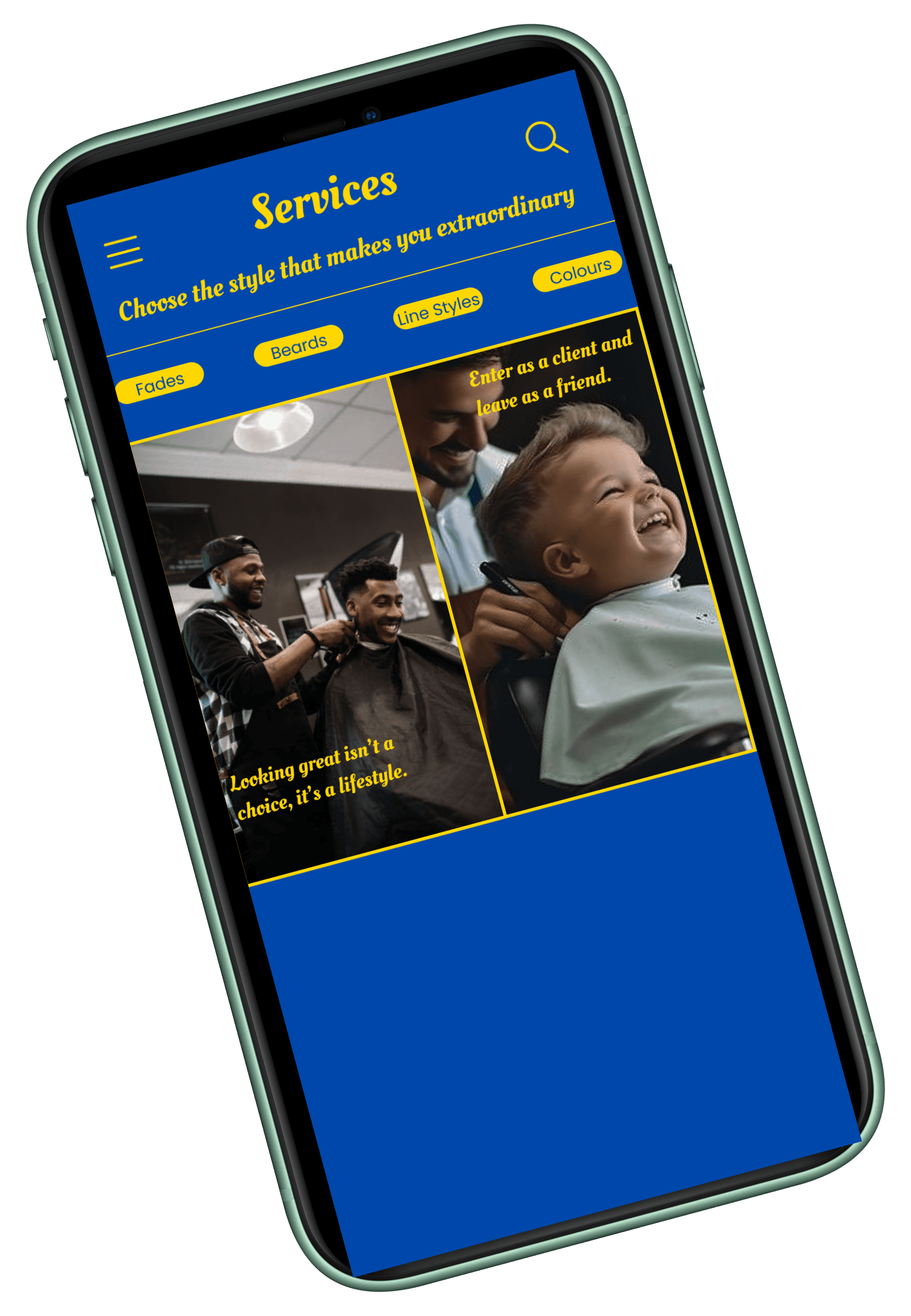
Visual layout of services with descriptions of haircut categories such as Fades, Beards, Line Styles and Colour styles. Each category has images of hair styles, prices and the order buttond.
A page where users will be required to add their personal details, the button that will lead to users adding their time schedule for the appointment and two option buttons for users to select their payment plan for the transaction to be successful.
This is the page where users are required to add in their personal information and add the time they are available to book for an appointment to the barber shop.
A thank you message page to verify to the user that the transaction has been successful to avoid confusion or uncertainty with the transaction.
Information that is necessary for users to keep in touch with the barber shop, understand the working hours and where the business is actually located and this also builds trust that this is a genuine business.
User Feedback
I love this app, it looks like an application that I can depend on with my time.
The booking navigation feels easy and simple to follow through.
I love the idea of having one of the barbers come to my residential place offer their service, it saves my time.
The designs looks amazing and very professional.
I admire the variety of different styles I can choose from, with the clear images.
As a result 80% of the users loved the idea of the app.
Reflection & Learnings
Small Details Matter : Factors such as spacing and alignment need to improve to build assurance. Use auto layout more.
Don’t Overload : Prevent adding too many animations or text, it can overwhelm the users.
Collaborate More : Get users involved more in the intial stages and not just at the end of the design process.
App Redesign
Case Study

The colour theme is luxury and dependable
Headlines : Oleo Script - Bold.
After