
App Redesign
Case Study
Duration:
4th August - 22nd August 2025
(3 weeks)
Project Overview
The objective of this project was to redesign the PicknPay mobile app to improve the online shopping experience, concentrating on real-time stock visibility, communication efficiency and customer satisfaction.
This Case study follows the design thinking process - empathise, define, ideate, prototype and test to demonstrate my problem solving approach and user centered thinking.
Target Audience
The redesign was aimed at online retail customers who prefer shopping digitally rather than in-store. These users value convenience, transparency and reliability in their online shopping experience - expecting accurate stock information, quick support and smooth order handling.
Empathise
To understand user pain points, I reviewed customer feedback and app reviews.
Here is what I discovered :
Users found the app more user-friendly than some competitiors but wanted better notifications for out of stock items.
Many users experienced refund delays due to missing items after placing orders.
The app charged incorrectly when item replacements were made, customer service responses were slow.
Customers felt frustrated ordering items only to learn later that they were unavailable making other purchaces feel like a waste of time
“I think it would be best to ask if we still want to proceed with the order when items are not available.”
These insights revealed clear emotional pain points, users wanted clarity, fast feedback and more control over their shopping experience.
Define
After analysing the insights in the empathise stage, I defined the key problems as :
Lack of real-time stock notifications - users only find out items are unavailable after placing an order.
Poor communication and support - Customers find it difficult to reach customer service or get timely refunds.
Limited user control - users can’t easily cancel or adjust orders once items are depleted.
Ideate
Based on user needs and pain points, I brainstormed several design solutions including competitive analysis:
Instant Out-of-stock Alerts- when a user taps “Add to cart” the app immediately notifies them if the product is out of stock and offers alternative suggestions.
Live Shopper Communication Channel- once an order is placed, customers can chat directly with a live in-store shopper, confirming product availability and prevent disputes with users over unavailable products after purchasing the product.
Order Decision Option- before purchasing the product, users can choose to proceed or cancel if key items are unavailable.
In-App Support Tab- A dedicated “Admin” section allows users to submit queries or complaints directly in-app, reducing long response times.
These ideas aimed to make the app feel more responsive, human and trustworthy.
Hi-Fi Designs - Key design screens

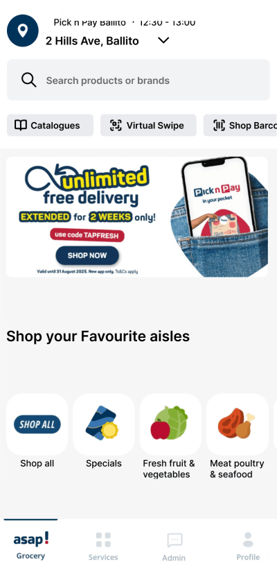
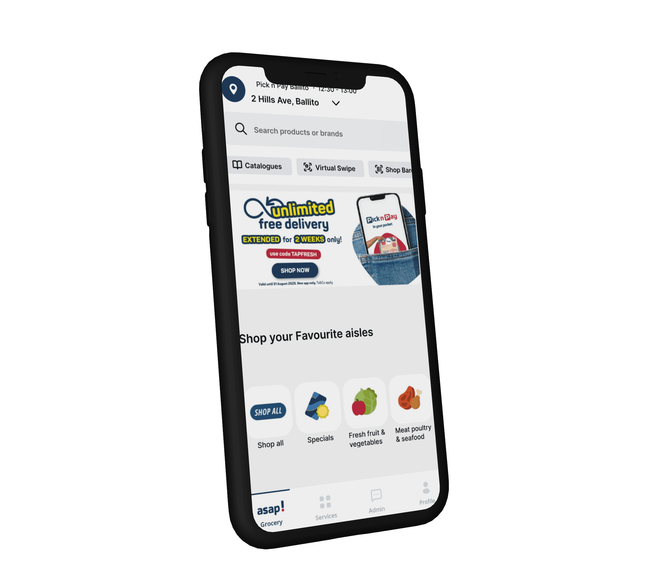
This is where users search and find different categories of items they need and also access different interfaces through the tabs such as admin for assistance.
Home Page
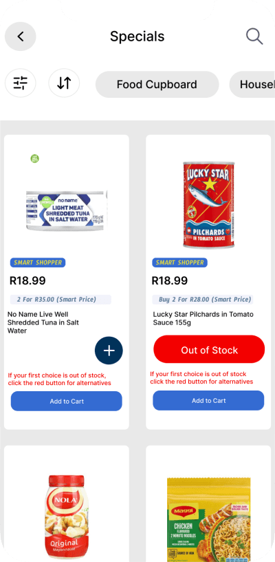
This is a category where users find items on promotion or at a lower price. Each product has the plus sign to add to cart and if they are depleted they receive the “out of stock” notification with the option to select alternative products after they click the red out of stock button.
Product Categories
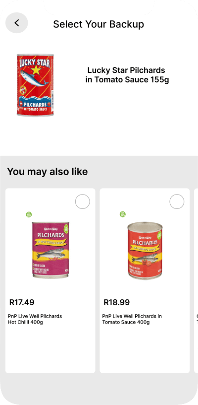
A page where users find alternative products incase their first choice is out of stock, all they have to do is click on to the product they will be led to the product details page and add to cart. This is key to keep users engaged and spend on the business products.
Product Alternatives
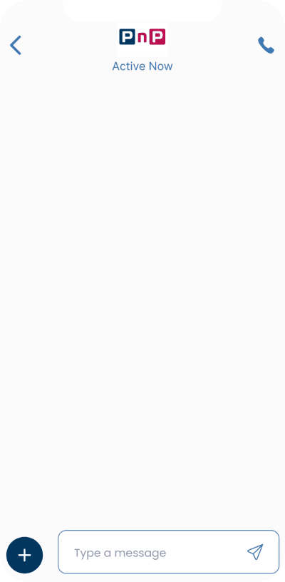
Users always had an issue with not being able to have easy and quick access to help or support but with this implementation it will minimise this problem, once again another way to retain users.
Admin Messaging
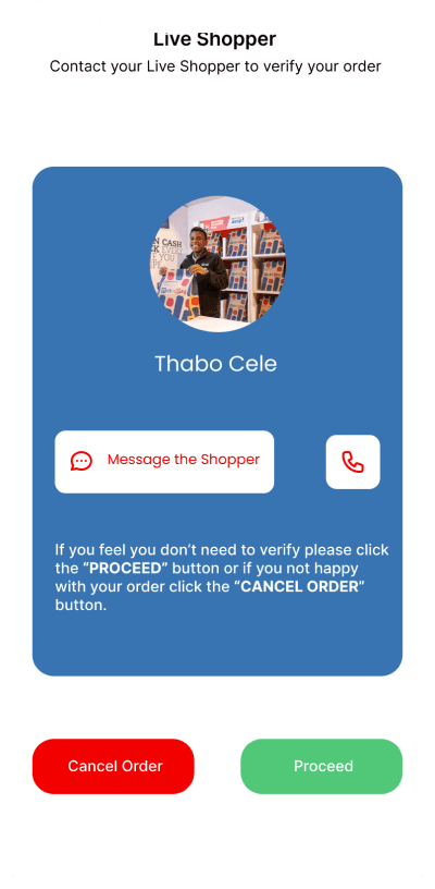
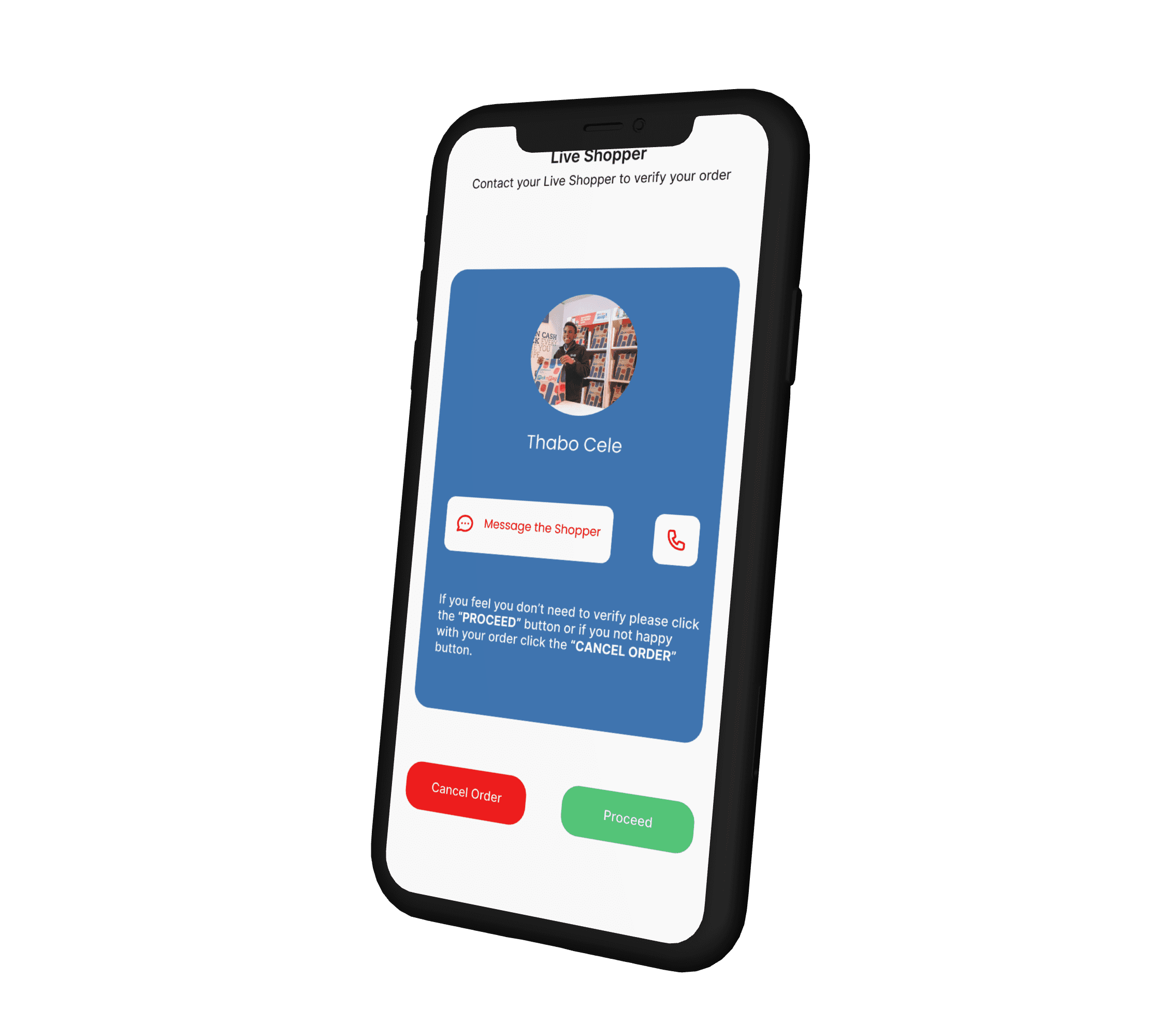
After a customer places an order, the live shopper will be shown with an image and name with an interactive chat created, to form a communication channel between the live shopper and customer. This is a great way for customers to verify if the products they want is available and for the live shopper to verify with the customer about products. This way it is much easier to cancel the order without having to be involved in constant refund situations or unavailable product disputes.
Live Shopper
Visual Design
Primary Colour
Accent Colour
Secondary Colour
#00335A
#FFFFFF
#F30000
Prototype
I designed a high-fidelity prototype using Figma, focusing on simplicity and user flow clarity.
Key design features :
A modern, clean interface that priortises usability.
Real-time stock notifications implemented into product interfaces along with a screen that shows alternative products.
A chat interface connecting customers with live shoppers at the store
A cancel or proceed prompt for ordered products.
Admin tab accessible from the home page.
Aa
Font
Inter
The colour theme is trust, reliability and boldness.
Test & Outcome
The prototype was tested with actual users and the feedback was positive. Users loved the idea of being able to contact the live shopper directly, as it made the experience feel personal and clear.
They also liked the option to cancel or proceed with their order before payment giving them greater control and confidence when shopping online.
The admin tab for general enquiries made communication smoother and faster, while real-time stock notifications and alternative product screen created an easy experience and efficient browsing experience.
Key Outcomes :
90% user satisfaction due to improved improved clarity.
Higher user satisfaction due to improved improved clarity.
Reduced refund related frustration.
Enhanced trust and reliability in the online shopping process.
This redesign shows how thoughtful UX decisions can turn common retail frustrations into valuable customer experiences that strengthen brand loyalty.
Reflection
This project strengthened my skills in:
Translating user frustrations into actionable design goals.
Applying design thinking to solve real-world eCommerce problems.
Balanced business goals ( efficiency, fewer refunds) with user needs ( control, transparency).
Through this redesign, I learned that small UX improvements like real time feedback and human communication touch points, that can have a massive impact on overall customer experience.
Thank you for viewing
Reach out via email: alianmuvalahenry@gmail.com
Headline Font
Headlines : Inter
Body : Inter